Table Basics
About the Text and Image Table Item Types
A table is an item that displays a square or rectangular array of content. Image Table items display an array of images, while Text Table items display an array of rich text strings. These two item types behave identically, except for the way in which they interpret and display their content.On This Page
Configuring a TableSpecifying the Content Size
Center-Align Rows
Background Colors
Cell Border Optons
How Text and Images are Sized and Placed Within Cells
Specifying the Content
Empty Cells
Overflow and UnderFlow
An example: Tic-Tac-Toe Cards
Configuring a Table
After creating a Table item and sizing it, select it and click the Table Format button in the Item Info area to open the Table Format window.
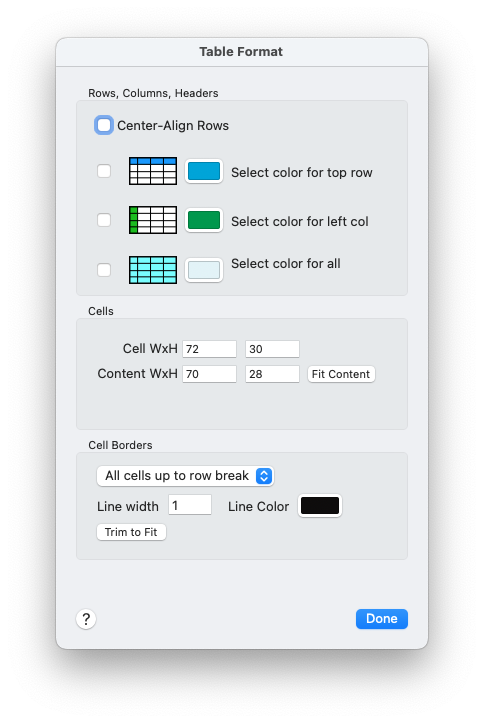
The Table Format configuration window.
Use the Cell WxH fields to set the size of each cell in the table, in points. For example, if your image table item has a size of 120x80 and you want it to display two rows of three images each, your cell size should be 40x40.
Setting the dimensions of an Image Table cell.
Note that the table item will be filled by cells at your selected cell size. The number of rows and columns is controlled by the size of the table and the size of its cells. To have more rows or columns, you must either increase the size of the table item or use the Cell WxH controls to specify smaller cells.
When you are satisfied with the table's overall dimensions and its cell size, you may wish to click the Trim to Fit button (do not confuse this with the Fit Content button) to automatically reduce the size of the table so that it is completely filled by its cells, with no extra space at the right and bottom edges. Trimming is not necessary, but if you use a background color for your table item, it might look nicer.
Specifying the Content Size
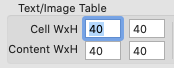
By default, images in Image Tables are proportionally sized to fit their cell. There is no spacing between cells, so that by default, there is no spacing between the images. Text in Text Tables has the Text Inset applied, so that there will be some spacing between the text blocks in adjacent cells.But sometimes you will want some separation for images in Image Tables, or to display images at a different size than the cell size, or to display text blocks in Text Tables with greater separation than is provided by the text inset. Use the Content WxH controls to specify a content size that is smaller than the cell size. Images and text strings will then be centered within their cells at a size that fits the specified content size, and the excess space will be empty.
Note that if your table shows cell borders, these will take up space. To avoid having your images overlap the cell borders, you must use a reduced content size. The Fit Content button in the Table Format window will do that for you: Select the Line Width that you want for your borders, then click the Fit Content button to automatically set the content size to the largest size that will not overlap the borders. (See How Text and Images are Sized and Placed Within Cells for more info.)
Using a content size that differs from the cell size is most useful for images, but can be done with text as well. For text, the text inset is applied to the content size, which means a double-inset: first the content size, then the text inset within that.
Overlapping Content
For Image Tables, you might want the esthetic effect of overlapping images. You can do this by specifying a larger content size than the cell size. Unlike most kinds of items, Table items allow content to be displayed outside the bounds of the table item itself if the content size exceeds the cell size.Because images in Image Tables are drawn in order from first to last, each oversized image will be overlapped by the image below and the image to its right, if any.
If your content size is too large for your cell size plus its borders, you will see a warning in red text just below the Content Size fields. This is a reminder, not an error; you may ignore it if you wish.
Center-Align Rows
This option has the effect of visually aligning the centers of all rows. Rows containing fewer cells than the table's number of columns are shifted to the right in order to center them.Row-centering is incompatible with the Cell Borders option "All". The Table Format window will ensure that incompatible options are not selected, and will change the cell borders option if necessary when row-centering is turned on.
Since by default all rows are filled left-to-right, the last row may be the only one that is centered. But you may use the Row Break markup command to end a row without necessarily filling it, so that rows in the middle of the table may also be shortened, and thus be centered.
See Table Markup for more information.
Background Colors
You may set an overall background color for your Table item by using the Background controls in the General toolbar in the main window, as usual.The Table Format window offers controls that allow choosing different colors for cells. These colors will override the Table item's own background color. If you select a top row color, all cells in the topmost row will use that color. If you select a left column color, all cells in the leftmost column will use that color (except where overridden by the top row color). If you select a color for all, all cells will use that color (except where overridden by the tow row and/or left column colors).
The table item's overall background color will be visible wherever there is no cell, and wherever no cell color has been specified.
Cell Border Options
By default, tables do not draw borders around cells. You may change this using the Cell Border controls in the Table Format window.Select an option from the Cell Borders popup:
- None - No borders will be drawn.
- Non-empty cells only - Borders will be drawn around all cells except those with no content.
- All cells up to row break - Borders will be drawn around all cells except for those which would otherwise appear following a row break.
- All - Borders will be drawn around all cells, regardless of location or content.
Use the Line Width and Line Color controls to set the appearance of the borders.
How Images are Sized and Placed Within Cells
Each cell of an Image Table item will display one image, which will be centered within the cell, and scaled to fit within the cell's content size. You can choose how images are scaled by using the Image Fit popup menu in the Image section of the Effects panel. Select your Table item, and use the popup to specify one of:- Fit in Bounds - Image is scaled proportionally and the entire image will be displayed in its cell's content area.
- Fit Horizontally - Image is scaled proportionally so that its entire width fits into its cell's content area. The image will be cropped vertically, if necessary.
- Fit Vertically - Image is scaled proportionally so that its entire height fits into its cell's content area. The image will be cropped horizontally, if necessary.
- Stretch to Fit - Image is stretched so that it completely fills its cell's content area. The image may be distorted if its aspect ratio is not the same as the content area.
There is no spacing between cells, so there is (by default) no space between the images. See Specifying the Content Size above for a way to control image size and spacing between images.
How Text is Configured and Placed Within Cells
Each cell of a Text Table item will display one rich text string. You may set text characteristics (font, font size, font color, bold, italic, text alignment, etc.) for the table item itself, and they will apply to each string in its cell. (You may not set different characteristics per cell, but you may use rich text markup as usual when you wish, to change things like font, size, color, and so on for individual cells' values.)Within each cell, the text inset is applied to prevent the displayed text from butting up against the edges of the cell. (See Text Effects for information on changing an item's Text Inset.) You can change the spacing between the text blocks in the cells either by changing the content size or by changing the text inset, or both.
Tell me more about Content Size in Tables.
Specifying the Content
A list of either images or text strings (as appropriate) is specified in the table's field value. The simplest specification is just a list of image filenames or text strings, separated by commas:
For images you may include space characters after the preceding commas, if you wish, to enhance the readability of your content source.
Important: Normally leading spaces are not ignored. This convenience applies only to cells whose content is an image name with zero or more space characters preceding the image name.
As a convenience, if your images have the .png suffix, you can omit the suffix. If they have any other suffix, you must use the full filename.
Content may also include Table Markup commands.
Important - Literal Commas in Table Content
Do not attempt to use quotes to put literal commas in Text Table content, as you might do for Rich Text items. Instead, use the markup command {&comma} where you want a literal comma. Here is an example of three strings in text table content, where the middle string uses markup to specify literal commas:
The above content would produce three items in a Text Table that would look like this:
Empty Cells
If you specify no filename or string, you can leave a cell empty. Do this by putting no text between the commas. In this example, the second and fourth cells will be empty:
Overflow and Underflow
If you specify fewer images or strings than the table could hold, the remaining cells will be empty.If you specify more images or strings than the table can hold, the excess content will not be displayed.
An example: Tic-Tac-Toe Cards
Suppose you wanted a deck of cards that all showed a different, partially filled-in tic-tac-toe board. Here's how you can use Multideck and the Image Table item type to do it.First, make some images. You'll need an image of an empty tic-tac-toe board; let's call it tictactoe.png. We'll also need an image of a scrawled X, which we'll make red for fun, and another image for a blue O. Call these x.png and o.png.
Next, create a new Multideck document and in the Deck tab, make sure that you are using the Content Editor for your Content Source. Select the Image Folder where you placed your image files, and select "Poker 2.5x3.5" for your card size.
Open the Content Editor. Click the Table Size button, and give your content two columns and any number of rows (this is just a demo, we don't really care how many cards we'll make). Name the two columns Board and XandOMatrix. For each card, enter tictactoe.png in the Board column. Leave the XandOMatrix column empty for now.
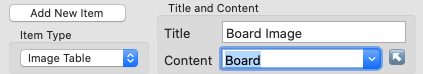
In the Layout tab in the main document window, add a new item that will be for the tic-tac-toe board image. Give it a type of Image and size it at 120x120 points. Title it Board Image, and use the Content popup to select the "Board" column.
Configuring the Board Image item.
Create another item, and select Image Table for its type. Give it a title (as always, the title doesn't matter except to you, so name it anything you like). Select the column XandOMatrix as its content. Give this table the same 120x120 size as the board image item, and position it right on top of the board image item. (This will look a little messy right now because these two item's titles will display right on top of each other, but that's okay.)
Open the Table Format dialog, and use the Cell WxH fields to set a cell size of 40,40 so that the table will show three rows of three cells each (because 120 / 3 = 40).
Hint: After setting the cell size, you can just drag out the item's size, and watch the faint gray gridlines to see when it's large enough to have three rows and three columns. You can make it a little larger than that; you don't have to be precise. Then click the Trim button to automatically make its size just right.
We'll want our Xs and Os to be smaller than the cell size, so that they fit well within the board areas. Use the Content WxH fields in the Table Format dialog to set a size of 30,30 to accomplish that.
For this exercise, make sure the Show gridlines option is not selected. We're using the background image to show a proper tic-tac-toe grid instead.
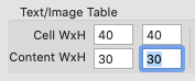
Setting the cell size to 40x40, and the image size to 30x30.
We're almost ready; all we need to do now is specify the image table values for each card. (Actually we could have done this earlier, but for this tutorial it made better sense to show the layout and configuration first.)
In the Layout tab, select the Preview option. In the Content Editor, select the cell in the XandOMatrix column for the first card, and enter this content:
This is a list of nine images, although some are simply empty. Each x specifies the image file named x.png (remember, you don't have to include the .png suffix), and similarly for the o's.
Now you can see what your first card looks like. Here it is:
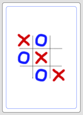
Card 1 in Preview mode.
Now you can add more cards to your content with different values in the XandOMatrix for each card!
Doing so has no effect; the curly braces are ignored. (The Images button in the Content Editor's Rich Text toolbar always inserts image names wrapped in curly braces. You can safely use the Images button to insert images in either Text Table or Image Table content.)